Create a Mobile Menu with the Popover API and No JavaScript
The “checkbox hack” is a CSS trick that uses a hidden HTML checkbox and the :checked pseudo-class to toggle UI states without using JavaScript. Typically, it involves a checkbox paired with a <label> (linked via the for attribute) styled to look like a button. When clicked, the label toggles the checkbox, and CSS selectors targeting :checked show or hide content, like a mobile menu.
I used this method for my website’s mobile navigation. When the screen width dropped below a certain threshold, the expanded menu was replaced by a hamburger icon (the three horizontal lines). It worked, but the solution felt clunky. The code was messy, not great for accessibility (despite passing tests), and felt like… well, a hack.
Then I discovered the Popover API.
What Is the Popover API?
The Popover API is a modern HTML feature that enables developers to create lightweight overlays such as menus, tooltips, dialogs, or dropdowns without JavaScript for basic toggling. It allows content to appear on top of other content using only HTML and CSS. Think of it as a more flexible alternative to <dialog>, with better integration and styling options. It gained full browser support in April 2024.
Popover content is triggered using standard HTML attributes. No JavaScript is needed unless you want advanced behavior. Once I saw how it worked, I replaced the checkbox hack on this website with clean, semantic HTML and CSS. I’m not anti-JavaScript, but I avoid using it where native HTML/CSS will do the job.
Just to be clear, this isn’t the pastry. That popover is flaky and terrible at managing UI state, though it is delicious in fallback situations.
HTML Global Attributes
The Popover API uses a few new global HTML attributes. While these can technically be used on any HTML element, they’re most commonly applied to containers like <nav> or <div>.
| Attribute | Purpose |
|---|---|
popover | Marks an element as a popover that can be toggled. |
popovertarget | Declares which element should be shown/hidden. |
popovertargetaction | Specifies the action: toggle, show, or hide. |
Browser Support
Full support is available across a wide range of commonly used browsers.
| Browser | Version Supported |
|---|---|
| Chrome | 114+ |
| Firefox | 114+ |
| Safari | 17+ |
| Edge (Chromium) | 114+ |
| Opera | 100+ |
Mobile Menu Using the Popover API
Here’s how to build a responsive mobile menu using only HTML and CSS.
HTML
The menu consists of two <nav> elements, one for desktop and one for mobile, and a pair of buttons to open and close the popover. This separation ensures that each menu is styled and behaves appropriately based on the viewport size.
Key Elements
- The desktop menu (
<nav id="desktop-menu">) is the traditional, always-visible navigation bar shown on larger screens. It includes links arranged horizontally. - The
Show Menubutton (<button id="mobile-menu-btn-show">) is hidden by default but becomes visible on smaller viewports (under768px). It includes:popovertarget="mobile-menu"which links the button to the popover element,popovertargetaction="show"which indicates this button opens the popover when pressed, and ARIA attributes (aria-label,aria-controls) to improve screen reader support. - The mobile menu (
<nav id="mobile-menu" popover>) which is hidden by default and appears as a popover when triggered. Thepopoverattribute designates it as an interactive overlay. Its structure mirrors the desktop menu, but is optimized for vertical display on mobile. - The
Close Menubutton (<button id="mobile-menu-btn-close">) which is placed inside the mobile menu and includes:popovertarget="mobile-menu"which targets the same popover element,popovertargetaction="hide"which indicates this button hides the popover when pressed, and ARIA attributes to assist with accessibility.
<header>
  <a href="/">My Site</a>
  <nav id="desktop-menu">
    <a href="/">Home</a>
    <a href="/about/">About</a>
    <a href="/blog/">Blog</a>
  </nav>
  <button
    id="mobile-menu-btn-show"
    popovertarget="mobile-menu"
    popovertargetaction="show"
    aria-label="Show Site Menu"
    aria-controls="mobile-menu"
  >
    Show Menu
  </button>
  <nav id="mobile-menu" popover>
    <button
      id="mobile-menu-btn-close"
      popovertarget="mobile-menu"
      popovertargetaction="hide"
      aria-label="Close Site Menu"
      aria-controls="mobile-menu"
    >
      Close Menu
    </button>
    <a href="/">Home</a>
    <a href="/about/">About</a>
    <a href="/blog/">Blog</a>
  </nav>
</header>
CSS
The CSS handles layout, visibility, and responsive behavior, allowing the mobile menu to work seamlessly without JavaScript. Flexbox is used to arrange elements inside the header and menus, and media queries adjust the layout for smaller screens.
By default, the desktop menu is shown and the mobile menu (marked with the popover attribute) is hidden. When the viewport shrinks below 768px, the desktop menu is hidden, and the Show Menu button appears. Clicking this button reveals the mobile menu as a popover overlay.
The mobile menu is styled to appear from the top-right corner and extend the full height of the screen. It stacks links vertically and includes a Close Menu button that hides the popover when clicked. The :popover-open pseudo-class is used to apply styles when the popover is visible, and the ::backdrop pseudo-element adds a translucent dark layer behind the menu for better focus.
This setup ensures the navigation is both responsive and accessible, with a native-feeling toggle experience.
header {
  display: flex;
  justify-content: space-between;
}
#desktop-menu {
  display: flex;
  gap: 1.5rem;
}
#mobile-menu-btn-show {
  display: none;
  cursor: pointer;
}
#mobile-menu-btn-close {
  width: fit-content;
  cursor: pointer;
}
#mobile-menu {
  flex-direction: column;
  gap: 1.5rem;
  height: 100%;
  inset: unset;
  top: 0;
  right: 0;
  background-color: #fff;
  border: none;
  padding: 1rem 0.25rem 0 1.5rem;
}
#mobile-menu:popover-open {
  display: flex;
}
#mobile-menu::backdrop {
  background-color: rgba(0, 0, 0, 0.2);
}
#mobile-menu a {
  width: fit-content;
}
@media (max-width: 768px) {
  #desktop-menu {
    display: none;
  }
  #mobile-menu-btn-show {
    display: flex;
  }
}
Results
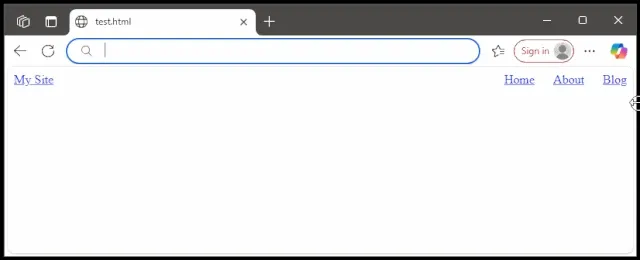
The final implementation delivers a clean, responsive navigation menu that works smoothly across devices. On desktop screens, the standard horizontal menu is displayed. On smaller viewports (like phones or tablets), the desktop menu is hidden and a Show Menu button appears. Tapping the button opens the mobile menu as a popover from the top-right corner, complete with a semi-transparent backdrop.
Inside the popover, links are stacked vertically for easy tapping, and a Close Menu button hides the menu when you’re done. Again, all interactions happen without JavaScript, using only HTML, CSS, and the built-in Popover API.
This result demonstrates a modern, accessible, and JavaScript-free approach to mobile navigation using native web platform features.
Summary
The Popover API offers a clean way to build interactive elements like mobile menus without JavaScript or hacks required. It improves semantics, accessibility, and maintainability. If you’re still relying on the checkbox hack, consider switching to the Popover API.