Excel: Combination Clustered and Stacked Column Chart
Excel does not have a built-in clustered and stacked chart, but you can create one using a combo chart with a secondary axis.
Clustered charts, or grouped charts, compare multiple data series grouped by a common category. For example, a clustered chart may display columns (vertical) or bars (horizontal) next to each other to compare forecast vs. actual spend for each month.
Stacked charts, on the other hand, show individual segments within a total column or bar, such as the breakdown of actual spend by type for a given month.
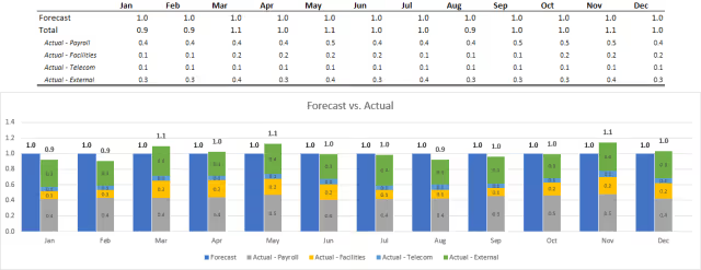
In this example, the clustered and stacked column chart compares forecast vs. actual spend for a month (clustered), with actual spend further broken down by type (stacked).
Let’s begin by showing a screenshot of the expected result.

Instructions
Step 1: Structure the Data
There are several ways to create a combined clustered and stacked chart in Excel. The method shown in this example keeps the data organized in an easy-to-read format. An alternative approach involves adding extra blank cells throughout the data, which I find more complicated and makes the data harder to read and use for other purposes.
In our data, Forecast and Total actual spend are structured as rows (series), and months are arranged as columns (categories). The Total actual spend is broken down further into separate rows for each spend type, such as Actual - Payroll, Actual - Facilities, Actual - Telecom, and Actual - External. The Total row is simply the sum of these individual spend types for each month.
The values are formatted using a custom number format (shown below) to display in millions. Although the underlying value is 1,000,000, Excel shows it as 1.0.
#,##0.0,,;[Red](#,##0.0,,)
Step 2: Include Helper Data
Next, add two empty rows (series) below the data.
Label them Spacer 1 and Spacer 2, and change the font color to white to hide them (assuming the sheet background is white). These spacer rows will be used later to control the gap and overlap between columns.
Also, add two formulas to calculate the minimum and maximum values of the data series. These values will later help set the bounds for the Primary Axis and Secondary Axis.
=MIN($B$2:$M$3)=MAX($B$2:$M$3)
Step 3: Create a Clustered Column Chart
Select all the source data, including the spacer rows, but excluding the minimum and maximum helper data.
From the Insert ribbon, in the Charts section, click the Clustered Column button to insert a new chart.

The chart displays a separate column for each data series, grouped by month along the horizontal axis.

Step 4: Change Chart Types
Click on the chart.
From the Chart Design ribbon, click Change Chart Type. The Change Chart Type dialog box opens.
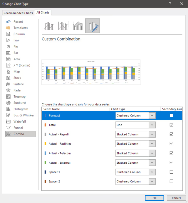
Go to the All Charts tab and select Combo.
Each data series will have options to change its Chart Type and Axis.
Set the Forecast, Spacer 1, and Spacer 2 series to Clustered Column with the Secondary Axis unchecked.
Set the Actual - Payroll, Actual - Facilities, Actual - Telecom, and Actual - External series to Stacked Column with the Secondary Axis checked.
Set the Total series to Line with the Secondary Axis checked.

Step 5: Adjust the Series Overlap and Gap Width
Click the Forecast data series column in the chart.
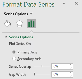
From the Format ribbon, click Format Selection. In the Series Options, adjust the Series Overlap and Gap Width sliders so the Forecast series does not overlap with the stacked column. In this example, I set both sliders to 0%, which created no overlap and a small gap. You may need to fine-tune these values based on your data.

Step 6: Add Data Labels
For each data series in the chart, click its column, stacked segment, or line, then click Add Data Labels.
For the Total line, click Format Data Labels and set the Label Position to Above.

Step 7: Adjust Axis Bounds
Depending on the data series, the Primary Axis and Secondary Axis may be misaligned due to different minimum and maximum bounds. In our example, the Primary Axis upper bound is 1.2, while the Secondary Axis upper bound is 1.4. We need to align the scales so the chart columns are visually comparable.
Click the chart.
From the Chart Design ribbon, click Select Data.
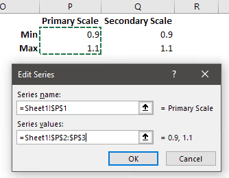
In the Legend Entries (Series) section, click Add. For Series Name, select the cell with the Primary Scale header. For Series Values, select the cells with the corresponding minimum and maximum values.
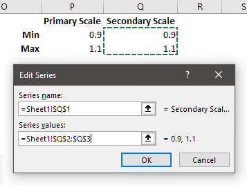
Repeat the same process for the Secondary Scale series.
Click the chart.
From the Chart Design tab, click Change Chart Type. The Change Chart Type dialog box opens.
You’ll now see the two new data series in the list.
Set the Primary Scale series to Line, with the Secondary Axis unchecked.
Set the Secondary Scale series to Line, with the Secondary Axis checked.
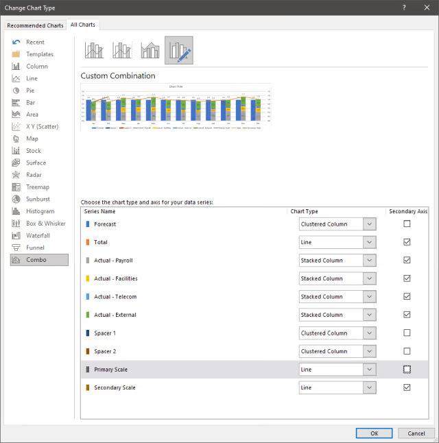
Both the minimum and maximum bounds for the Primary Axis and Secondary Axis are now aligned at 1.4.

Step 8: Formatting and Clean-up
At this point, several extra chart elements need to be removed or hidden.
In the Legend, click the Spacer 1 label to highlight it, then press delete to remove it. Repeat this for the Spacer 2, Total, Primary Scale, and Secondary Scale legend entries.
Since the Primary Axis and Secondary Axis are now the same, remove the Secondary Axis labels by clicking them and pressing delete.
Next, remove the extra chart lines for Total, Primary Scale, and Secondary Scale. Starting with the Total line, selecting its data series in the chart, then go to the Format ribbon, and select Format Selection. In the Fill & Line options, choose No Line.
Repeat this for the Primary Scale and Secondary Scale lines.
Finally, update the title to better describe the chart.
Results
We now have a combined clustered and stacked column chart with totals above the stacked column. Our data table remains intact and readable while the helper data and chart elements are hidden from casual viewers. The aggregate total of the stacked column is also displayed above the column.
Summary
While Excel does not have a default clustered and stacked chart type, we created one in this demonstration using a combo chart with a secondary axis. The process involves structuring the underlying data, adjusting chart types, aligning axis bounds, and cleaning up unnecessary elements to produce a clear, readable chart.