Build a Power BI Segmented Progress Gauge With Deneb and Vega
Power BI includes a built-in gauge visual, but a custom gauge provides control over colored performance bands, the needle, and the text. Deneb makes it possible to build this type of visual directly in Power BI using the Vega visualization grammar.
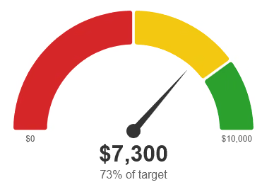
This example creates a semicircular gauge with three colored segments, a needle that points to the current value, the current value as text, and the percentage of the target reached. The segment lengths and colors are defined by signals, so the same visual can represent performance bands such as poor, acceptable, and good. It can also represent sales attainment, budget utilization, service level compliance, or other measures of numeric progress.
The gauge can display currency, quantities, or any other numeric measure. Dates, durations, and text-based statuses must first be converted into suitable numeric measures.
Data Setup
The visual uses two numeric values:
- Current Value: The amount or quantity achieved so far.
- Target: The value representing 100% of the gauge.
The specification uses CurrentValue and Target as its default field names. The currentValueField and targetField signals can be changed to match the measure names used in a report.
The specification reads the first row of the Deneb dataset. The current value and target must therefore resolve to a single row for the intended result. A dataset containing multiple rows is not automatically aggregated by this specification.
The target should be greater than zero. A zero or negative target does not provide a meaningful scale for measuring progress.
The segments are not part of the dataset. Their lengths and colors are defined by signals in the specification.
The embedded dataset definition contains a single sample row, which allows the specification to be previewed in the Vega Editor before it is connected to Power BI. The currentValueDefault and targetDefault signals, both set to 0, apply only when the dataset contains no rows. Once the visual uses the Power BI dataset, the values come from that dataset instead.
How the Vega Specification Works
The visual combines signals, three data sources, and graphical marks to construct the gauge. The dataset source holds the Power BI data, the segments source contains one record for each colored segment, and the scaleEnds source contains the two records used to label the ends of the arc.
The complete Vega specification appears in the Source Code section at the end of this article. It can be pasted into the Deneb editor with the included sample data.
Configure the Signals
Every color, font, size, and spacing value is defined by a signal, so the appearance can be changed without editing the marks. The signals are arranged in groups, and a blank line separates each group:
- Data: The field names and the fallback values.
- Formats: The number formats for the values and the text appended to the percentage.
- Segments: The length and color of each segment, the gap between segments, and the corner rounding.
- Gauge geometry: The start and end angles, the arc thickness, and the minimum radius.
- Pointer: The needle and hub colors and sizes.
- Layout: The overall size, the padding, and the spacing around the text.
- Typography: The font family, sizes, and weights.
- Colors: The background and text colors.
- Calculated: The values derived from the signals above. These normally do not need to be edited.
The valueFormat signal controls how the current value is displayed. Its default format, $,.0f, displays whole-dollar amounts with thousands separators. The scaleLabelFormat signal applies the same type of format to the labels at the ends of the arc. For quantities that do not represent currency, ,.0f displays whole numbers with thousands separators but no currency symbol. The scale end labels are centered under the ends of the arc, so a long formatted target can extend past the edge of the visual. Setting scaleLabelFormat to a compact format such as $.3~s displays values such as $12.5M.
The percentFormat signal formats the percentage, and the percentSuffix signal supplies the text that follows it. The default suffix, " of target", produces text such as 73% of target. An empty string removes the suffix.
Define the Segments
Two array signals define the segments:
{ "name": "segmentLengths", "value": [0.5, 0.3, 0.2] },
{ "name": "segmentColors", "value": ["#d62728", "#f2c811", "#2ca02c"] }
With the default values, the red segment covers 0% to 50% of the target, the yellow segment covers 50% to 80%, and the green segment covers 80% to 100%. The lengths are normalized, so they do not need to sum to one. A value of [1, 1, 2] produces segments that cover 25%, 25%, and 50% of the target.
The segmentPadDegrees signal sets the gap between neighboring segments in degrees, and the arcCornerRadius signal rounds the corners of each segment.
The segments data source is generated from these signals instead of the dataset. A sequence transform creates one record for each entry in segmentLengths, and formula transforms attach the length and color to each record. A joinaggregate transform calculates the total length, and each record’s share is its length divided by that total. A window transform accumulates the shares so that every record has a start and an end position. Formula transforms then convert those positions into start and end angles.
Because the number of records follows the length of the arrays, a segment can be added by adding an entry to both segmentLengths and segmentColors. Every length needs a matching color, because a segment without a color is not drawn.
Calculate Progress
The specification calculates two progress values from the current value and the target.
The pct signal is limited to the range from zero to one, and it positions the needle. The percentReached signal is not limited, and it provides the percentage displayed in the text.
A current value of 7,300 against a target of 10,000 produces a value of 0.73 for both signals, or 73%. The needle points to the yellow segment, which covers 50% to 80% with the default lengths.
When the current value exceeds the target, the needle stops at the end of the arc, while the text continues to show the actual percentage. A current value of 13,500 against the same target displays 135% of target. A negative current value places the needle at the start of the arc.
Position the Needle
The gaugeStartAngle and gaugeEndAngle signals define the sweep of the arc in degrees. An angle of zero points straight up, and positive angles move clockwise. The defaults of -90 and 90 produce a semicircle with its flat edge at the bottom.
The pointerAngle signal maps pct to a position between the start and end angles. The needle is drawn as a tapered triangle from the hub to the tip, and its outline is calculated from the sine and cosine of the pointer angle.
The needleBaseWidth signal sets the width of the needle at the hub, and the needleTipOffset signal sets how far the tip stops short of the inner edge of the arc. A negative offset extends the needle into the arc. A circle at the center of the gauge covers the base of the needle, and the hubRadius signal sets its size.
Adjust the Layout
The containerWidth and containerHeight signals control the overall size, and the example uses 360 by 260 pixels. The outer radius of the arc is the smaller of half the drawing width and the height remaining after the text block, and it never falls below the minOuterRadius signal. The arc thickness is the arcThicknessRatio signal multiplied by the outer radius, so the arc scales with the visual. The gauge and the text below it are centered in the visual.
Values such as hubRadius, needleBaseWidth, the font sizes, and the spacing signals remain fixed. If the visual is much smaller than the 360 by 260 pixel default, reduce those values.
The layout assumes that the arc sweeps 180 degrees or less, because the text is placed below the center of the gauge. A larger sweep requires changes to the layout calculations.
Draw the Gauge
The gauge is constructed from several Vega marks:
- Segment arcs: One arc for each colored segment.
- Needle: The triangle that points to the current value.
- Hub: The circle at the base of the needle.
- Value label: The current value, displayed below the hub.
- Percentage label: The percentage of the target reached, displayed below the value.
- Scale end labels: The values at the start and end of the arc, which are zero and the target.
Connect the Visual to Power BI
After testing the specification with its sample data, connect it to the report’s measures. This example was built with Deneb 2.0.0 using Vega 6.
- Add the Deneb visual to the report.
- Select
Vegaas the visualization language. - Add
CurrentValueandTargettoValues.
Deneb exposes each data field to Vega by the name shown in the Values field well, so the names must match the specification. If the model columns use different names, rename the fields in the Values field well or set the currentValueField and targetField signals to those names.
- Add the Vega specification.
- Replace the embedded
datasetdefinition, including the sample values, with the definition shown below.
{ "name": "dataset" }The segments and scaleEnds data sources are unchanged because they are generated within the specification.
- Optionally, connect the size of the gauge to the size of the Power BI visual by replacing the
containerWidthandcontainerHeightsignals with the following definitions:
{ "name": "containerWidth", "update": "denebContainer.width - 10" },
{ "name": "containerHeight", "update": "denebContainer.height - 10" }
The denebContainer.width and denebContainer.height values report the size of the Power BI visual. The subtraction leaves a small margin around the gauge. If scrollbars appear, increase the amount subtracted. These values are provided by Deneb, so the fixed dimensions remain useful when testing the specification elsewhere, such as the Vega Editor.
- Apply the specification and confirm that the gauge displays the expected value, percentage, and segments.
Results
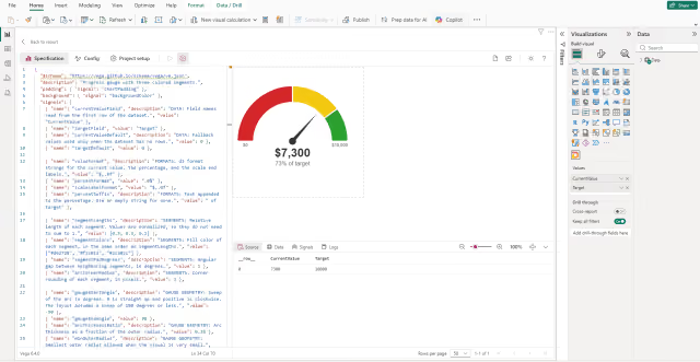
The completed visual provides a compact view of progress toward a numeric target. It displays the current value, the percentage reached, and the performance bands in a gauge layout.
The result should have the following characteristics:
- The needle rests at the start of the arc when the current value is zero.
- The needle moves clockwise along the arc as the current value increases.
- The three segments divide the arc according to their lengths, and the needle indicates the segment that contains the current value.
- The current value and the percentage of the target are displayed below the hub.
- A current value above the target places the needle at the end of the arc, and the percentage continues to show the actual amount.
- The scale end labels show zero and the target.
- The gauge and its text are centered in the visual. The size follows the Power BI visual when the optional container step is applied.
The same visual can be reused for different measures by changing the field names, formatting, segment lengths, and colors.
Troubleshooting
The following are common issues when connecting the specification to a report.
- When the needle rests at the start and the gauge displays 0%, the
currentValueFieldortargetFieldsignal likely does not match a name shown in theValuesfield well. The specification treats a missing value as zero and does not display an error, so set both signals to the exact field names. If the names already match, a blank target also produces 0%, so check the target as described next. - When the label at the end of the arc shows zero or a negative amount, the target is likely blank, zero, or negative. The specification supports only positive targets, and the needle remains at the start with 0% displayed. Confirm that the target measure returns a positive value for the filters applied to the visual.
- When the values do not match the expected result, the dataset likely contains more than one row. The specification reads only the first row, and an additional field in
Values, such as a category, produces multiple rows. Remove the extra field or filter the visual to a single row. - When the gauge is clipped or scrollbars appear, the fixed default size likely does not match the visual. Apply the optional container size step in the Connect the Visual to Power BI section, and increase the amount subtracted if scrollbars remain.
- When the scale end labels overlap the value text, the visual is likely too narrow. Increase the width, or reduce the
scaleLabelFontSizeandvalueFontSizesignals. - When a segment does not appear, the
segmentColorssignal likely contains fewer entries than thesegmentLengthssignal. Each length requires a matching color.
Source Code
{
  "$schema": "https://vega.github.io/schema/vega/v6.json",
  "description": "Progress gauge with three colored segments.",
  "padding": { "signal": "chartPadding" },
  "background": { "signal": "backgroundColor" },
  "signals": [
    { "name": "currentValueField", "value": "CurrentValue" },
    { "name": "targetField", "value": "Target" },
    { "name": "currentValueDefault", "value": 0 },
    { "name": "targetDefault", "value": 0 },

    { "name": "valueFormat", "value": "$,.0f" },
    { "name": "percentFormat", "value": ".0%" },
    { "name": "scaleLabelFormat", "value": "$,.0f" },
    { "name": "percentSuffix", "value": " of target" },

    { "name": "segmentLengths", "value": [0.5, 0.3, 0.2] },
    { "name": "segmentColors", "value": ["#d62728", "#f2c811", "#2ca02c"] },
    { "name": "segmentPadDegrees", "value": 1 },
    { "name": "arcCornerRadius", "value": 3 },

    { "name": "gaugeStartAngle", "value": -90 },
    { "name": "gaugeEndAngle", "value": 90 },
    { "name": "arcThicknessRatio", "value": 0.28 },
    { "name": "minOuterRadius", "value": 40 },

    { "name": "needleColor", "value": "#333333" },
    { "name": "needleBaseWidth", "value": 10 },
    { "name": "needleTipOffset", "value": 6 },
    { "name": "hubColor", "value": "#333333" },
    { "name": "hubRadius", "value": 10 },

    { "name": "containerWidth", "value": 360 },
    { "name": "containerHeight", "value": 260 },
    { "name": "chartPadding", "value": 10 },
    { "name": "valueGap", "value": 8 },
    { "name": "lineGap", "value": 4 },
    { "name": "scaleLabelGap", "value": 6 },

    { "name": "fontFamily", "value": "sans-serif" },
    { "name": "valueFontSize", "value": 32 },
    { "name": "valueFontWeight", "value": "bold" },
    { "name": "percentFontSize", "value": 16 },
    { "name": "percentFontWeight", "value": "normal" },
    { "name": "scaleLabelFontSize", "value": 12 },
    { "name": "scaleLabelFontWeight", "value": "normal" },

    { "name": "backgroundColor", "value": "#ffffff" },
    { "name": "valueColor", "value": "#333333" },
    { "name": "percentColor", "value": "#666666" },
    { "name": "scaleLabelColor", "value": "#666666" },

    { "name": "currentValue", "update": "data('dataset').length ? toNumber(data('dataset')[0][currentValueField]) || 0 : currentValueDefault" },
    { "name": "target", "update": "data('dataset').length ? toNumber(data('dataset')[0][targetField]) || 0 : targetDefault" },
    { "name": "pct", "update": "target > 0 ? clamp(currentValue / target, 0, 1) : 0" },
    { "name": "percentReached", "update": "target > 0 ? currentValue / target : 0" },

    { "name": "width", "update": "containerWidth - 2 * chartPadding" },
    { "name": "height", "update": "containerHeight - 2 * chartPadding" },
    { "name": "gaugeStartRad", "update": "gaugeStartAngle * PI / 180" },
    { "name": "gaugeEndRad", "update": "gaugeEndAngle * PI / 180" },
    { "name": "segmentPadRad", "update": "segmentPadDegrees * PI / 180" },
    { "name": "textBlockHeight", "update": "hubRadius + valueGap + valueFontSize + lineGap + percentFontSize" },
    { "name": "outerRadius", "update": "max(minOuterRadius, min(width / 2, height - textBlockHeight))" },
    { "name": "innerRadius", "update": "outerRadius * (1 - arcThicknessRatio)" },
    { "name": "labelRadius", "update": "(outerRadius + innerRadius) / 2" },
    { "name": "cx", "update": "width / 2" },
    { "name": "cy", "update": "max(0, (height - outerRadius - textBlockHeight) / 2) + outerRadius" },
    { "name": "valueY", "update": "cy + hubRadius + valueGap" },
    { "name": "percentY", "update": "valueY + valueFontSize + lineGap" },

    { "name": "pointerAngle", "update": "gaugeStartRad + pct * (gaugeEndRad - gaugeStartRad)" },
    { "name": "needleLength", "update": "max(0, innerRadius - needleTipOffset)" },
    { "name": "needleDirX", "update": "sin(pointerAngle)" },
    { "name": "needleDirY", "update": "-cos(pointerAngle)" },
    { "name": "needlePath", "update": "'M' + (cx + needleLength * needleDirX) + ',' + (cy + needleLength * needleDirY) + 'L' + (cx + needleBaseWidth / 2 * -needleDirY) + ',' + (cy + needleBaseWidth / 2 * needleDirX) + 'L' + (cx - needleBaseWidth / 2 * -needleDirY) + ',' + (cy - needleBaseWidth / 2 * needleDirX) + 'Z'" }
  ],
  "data": [
    { "name": "dataset", "values": [{ "CurrentValue": 7300, "Target": 10000 }] },
    {
      "name": "segments",
      "transform": [
        { "type": "sequence", "start": 0, "stop": { "signal": "length(segmentLengths)" }, "step": 1, "as": "index" },
        { "type": "formula", "as": "raw", "expr": "segmentLengths[datum.index]" },
        { "type": "formula", "as": "color", "expr": "segmentColors[datum.index]" },
        { "type": "joinaggregate", "fields": ["raw"], "ops": ["sum"], "as": ["total"] },
        { "type": "formula", "as": "share", "expr": "datum.total > 0 ? datum.raw / datum.total : 1 / length(segmentLengths)" },
        { "type": "window", "sort": { "field": "index" }, "ops": ["sum"], "fields": ["share"], "as": ["endShare"], "frame": [null, 0] },
        { "type": "formula", "as": "startShare", "expr": "datum.endShare - datum.share" },
        { "type": "formula", "as": "startAngle", "expr": "gaugeStartRad + datum.startShare * (gaugeEndRad - gaugeStartRad)" },
        { "type": "formula", "as": "endAngle", "expr": "gaugeStartRad + datum.endShare * (gaugeEndRad - gaugeStartRad)" }
      ]
    },
    {
      "name": "scaleEnds",
      "values": [{ "fraction": 0 }, { "fraction": 1 }],
      "transform": [
        { "type": "formula", "as": "angle", "expr": "gaugeStartRad + datum.fraction * (gaugeEndRad - gaugeStartRad)" },
        { "type": "formula", "as": "value", "expr": "datum.fraction * target" }
      ]
    }
  ],
  "marks": [
    {
      "type": "arc",
      "name": "segmentArcs",
      "from": { "data": "segments" },
      "encode": {
        "update": {
          "x": { "signal": "cx" },
          "y": { "signal": "cy" },
          "startAngle": { "field": "startAngle" },
          "endAngle": { "field": "endAngle" },
          "innerRadius": { "signal": "innerRadius" },
          "outerRadius": { "signal": "outerRadius" },
          "padAngle": { "signal": "segmentPadRad" },
          "cornerRadius": { "signal": "arcCornerRadius" },
          "fill": { "field": "color" }
        }
      }
    },
    {
      "type": "path",
      "name": "needle",
      "encode": {
        "update": {
          "path": { "signal": "needlePath" },
          "fill": { "signal": "needleColor" }
        }
      }
    },
    {
      "type": "symbol",
      "name": "hub",
      "encode": {
        "update": {
          "shape": { "value": "circle" },
          "x": { "signal": "cx" },
          "y": { "signal": "cy" },
          "size": { "signal": "pow(2 * hubRadius, 2)" },
          "fill": { "signal": "hubColor" }
        }
      }
    },
    {
      "type": "text",
      "name": "valueLabel",
      "encode": {
        "update": {
          "x": { "signal": "cx" },
          "y": { "signal": "valueY" },
          "text": { "signal": "format(currentValue, valueFormat)" },
          "align": { "value": "center" },
          "baseline": { "value": "top" },
          "font": { "signal": "fontFamily" },
          "fontSize": { "signal": "valueFontSize" },
          "fontWeight": { "signal": "valueFontWeight" },
          "fill": { "signal": "valueColor" }
        }
      }
    },
    {
      "type": "text",
      "name": "percentLabel",
      "encode": {
        "update": {
          "x": { "signal": "cx" },
          "y": { "signal": "percentY" },
          "text": { "signal": "format(percentReached, percentFormat) + percentSuffix" },
          "align": { "value": "center" },
          "baseline": { "value": "top" },
          "font": { "signal": "fontFamily" },
          "fontSize": { "signal": "percentFontSize" },
          "fontWeight": { "signal": "percentFontWeight" },
          "fill": { "signal": "percentColor" }
        }
      }
    },
    {
      "type": "text",
      "name": "scaleLabels",
      "from": { "data": "scaleEnds" },
      "encode": {
        "update": {
          "x": { "signal": "cx + labelRadius * sin(datum.angle)" },
          "y": { "signal": "cy - labelRadius * cos(datum.angle) + scaleLabelGap" },
          "text": { "signal": "format(datum.value, scaleLabelFormat)" },
          "align": { "value": "center" },
          "baseline": { "value": "top" },
          "font": { "signal": "fontFamily" },
          "fontSize": { "signal": "scaleLabelFontSize" },
          "fontWeight": { "signal": "scaleLabelFontWeight" },
          "fill": { "signal": "scaleLabelColor" }
        }
      }
    }
  ]
}
Summary
Deneb and Vega make it possible to build a custom progress gauge for Power BI without a dedicated custom visual. The specification combines signal-driven segments, a calculated needle position, and graphical marks to display a current value against a target.
The visual can be adapted to different numeric measures by changing the field names, number formatting, segment lengths and colors, and dimensions. Its single-row data requirement and numeric-value limitation should be considered when connecting it to a report.