Power BI: Unicode Characters in Visualizations
A common requirement is to convert text-based values into colorful icons in Table or Card visualizations. Tools like Microsoft Power BI and TIBCO Spotfire make it easy to map specific data values or ranges to default icons through conditional formatting. However, because Card visualizations display the result of a measure rather than individual row values, displaying an icon requires a combination of DAX (Data Analysis Expressions) measures and Unicode characters.
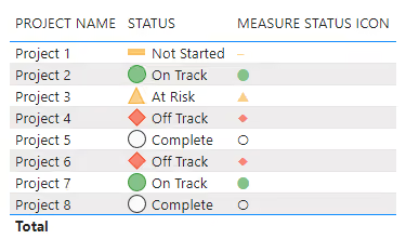
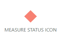
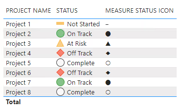
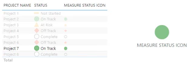
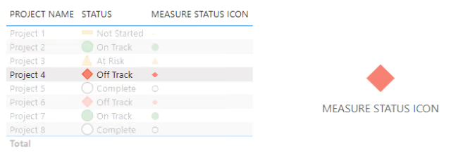
The following examples demonstrate two approaches, although the DAX approach is the primary focus. The STATUS column uses the default icons from conditional formatting in a Table visualization. The MEASURE STATUS ICON column uses a DAX measure to output a Unicode character, which is then colored with another DAX measure and conditional formatting. The DAX method is more versatile, as it can also be applied to other visualizations, like the Card visualization shown in the second image.
Instructions
Step 1: Create Underlying Data
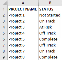
To demonstrate this, the underlying data is a list of PROJECT NAME and STATUS pair values in an Excel worksheet. The valid STATUS values are:
Not StartedOn TrackAt RiskOff TrackComplete
Step 2: Import Data
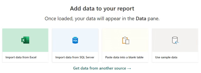
Begin by creating a new report in Power BI and importing the Excel file with the PROJECT NAME and STATUS list.
Click Import data from Excel and select the file.
Step 3: Transform Data
During the import process, transform the data if the column headings are not recognized. In the screenshot below, the columns are labeled Column1 and Column2 instead of PROJECT NAME and STATUS.
- Click
Transform Data.
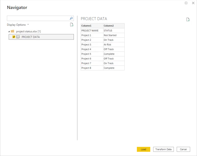
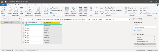
- The Power Query editor opens.
- From the
Hometab, in theTransformgroup, clickUse First Row as Headers. - Select
Use First Row as Headers. - Rename the query/table to
PROJECT DATA(used to reference this table in the DAX measures below).
Step 4: Map Status Values to Numeric Codes
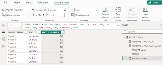
In this step, the text-based STATUS values are mapped to numeric values. This makes conditional formatting and DAX measures easier to configure later. It also centralizes the mapping, so if a status label changes, it only needs to be updated in one place rather than throughout multiple DAX measures and formatting rules.
- Switch to the
Table view. - From the
Table toolstab, clickNew column.
Using a SWITCH function, the text-based STATUS values are mapped to numeric values. Increments of 100 are used, although any unique integers will work. The new column is named STATUS NUMERIC:
Not Startedequals100.On Trackequals200.At Riskequals300.Off Trackequals400.Completeequals500.
STATUS NUMERIC =
SWITCH (
  [STATUS],
  "Not Started", 100,
  "On Track", 200,
  "At Risk", 300,
  "Off Track", 400,
  "Complete", 500
)
Step 5: Create DAX Measures
With numeric values now in the STATUS NUMERIC column, they can be used by two DAX measures: one returns a Unicode character and the other returns a hexadecimal color value.
- From the
Hometab, clickNew measure. - Add the following code to create the
MEASURE STATUS ICONmeasure. - Repeat this process to create the
MEASURE STATUS ICON COLORmeasure.
The numeric arguments passed to UNICHAR() are Unicode code points.
UNICHAR() supports any Unicode code point, so the icon set is not limited to the symbols used in this example. Geometric shapes, arrows, check marks, warning symbols, and even emoji can be used, although rendering depends on the font selected for the visualization and the fonts available on the user’s system.
- Figure Dash ‒
8210 - Black Large Circle ⬤
11044 - Black Up-Pointing Triangle ▲
9650 - Black Diamond ◆
9670 - White Circle ○
9675
MEASURE STATUS ICON =
  VAR vStatusNumeric =
    SELECTEDVALUE ( 'PROJECT DATA'[STATUS NUMERIC] )
  RETURN
    SWITCH (
      TRUE (),
      vStatusNumeric = 100, UNICHAR ( 8210 ),
      vStatusNumeric = 200, UNICHAR ( 11044 ),
      vStatusNumeric = 300, UNICHAR ( 9650 ),
      vStatusNumeric = 400, UNICHAR ( 9670 ),
      vStatusNumeric = 500, UNICHAR ( 9675 )
    )
Most standard Power BI fonts support these Unicode characters, but if a symbol does not render correctly, try switching the visual to another font such as Segoe UI.
SELECTEDVALUE() returns a value only when the filter context has narrowed STATUS NUMERIC down to a single row; otherwise it returns blank (or a specified fallback). For the Card visualization, that narrowing must come from something outside the visual itself, such as a Slicer or a Bookmark set to a single PROJECT NAME.
The measure returns hexadecimal RGB color values corresponding to black, green, yellow, and red. They are custom RGB values rather than the predefined HTML named colors. The 500 value is excluded from the color measure, as its default font color is already as expected.
MEASURE STATUS ICON COLOR =
  VAR vStatusNumeric =
    SELECTEDVALUE( 'PROJECT DATA'[STATUS NUMERIC] )
  RETURN
    SWITCH (
      TRUE(),
      vStatusNumeric = 100, "#000000",
      vStatusNumeric = 200, "#84C28A",
      vStatusNumeric = 300, "#F9D087",
      vStatusNumeric = 400, "#F78272"
)| Status | Numeric Code | Icon | Code Point | Hex Color |
|---|---|---|---|---|
Not Started |
100 | ‒ | 8210 | #000000 |
On Track |
200 | ⬤ | 11044 | #84C28A |
At Risk |
300 | ▲ | 9650 | #F9D087 |
Off Track |
400 | ◆ | 9670 | #F78272 |
Complete |
500 | ○ | 9675 | (default) |
NOTE: Although a standard
SWITCH()would also work here, usingSWITCH(TRUE())makes it easy to replace equality checks with ranges or more complex conditions later.
Step 6: Create Table Visualization
- Switch to
Report view. - Add a
Tablevisualization. - Add the
PROJECT NAME,STATUS, andMEASURE STATUS ICONfields asColumnsin theTable.
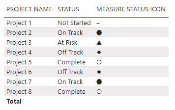
In the next steps, default icons are added to the STATUS column using conditional formatting with color applied to MEASURE STATUS ICON using a DAX measure. As shown in the screenshot, the DAX measure mapping numeric status to Unicode characters is working.
Step 7: Conditional Formatting for Default Icons in Table Visualization
- Click the
STATUSfield in theColumnslist for theTablevisualization. - Select
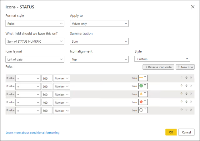
Conditional Formatting, thenIcons. - Follow the screenshot to configure the formatting using the
STATUS NUMERICcolumn created earlier, as shown. Power BI’s built-in icon rules operate on numeric values rather than the displayed text.
After applying conditional formatting, the STATUS column in the Table visualization will show icons.
Step 8: Conditional Formatting for Unicode Characters in Table Visualization Using DAX Measures
In this step, color is applied to the Unicode character icons.
- Click the
MEASURE STATUS ICONfield in theColumnslist for theTablevisualization. - Select
Conditional Formatting, thenFont color. - Follow the screenshot to configure the formatting using the DAX measure that maps numeric status to color.
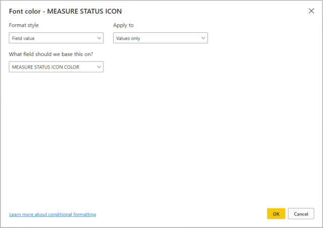
The Table visualization is now fully formatted using both methods.
Step 9: Create Card Visualization
Before creating the Card visualization, add a Slicer bound to PROJECT NAME and select a single project. This narrows the filter context so SELECTEDVALUE() returns exactly one STATUS NUMERIC value.
In Report view, add a Card visualization and include the MEASURE STATUS ICON field in the Fields.
NOTE: If both
CardandCard (new)appear in theVisualizationspane, either option works with this technique.
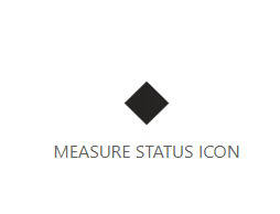
The Unicode icon is displayed correctly, but it is not yet colorized. The next step applies the same color measure used in the Table visualization.
Step 10: Conditional Formatting for Unicode Characters in Card Visualization Using DAX Measures
- Click the
Cardvisualization and go to itsFormat visualoptions. - Under
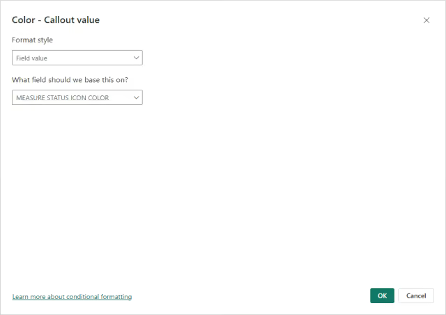
Callout value, click thefxbutton forColor. - Configure the options as shown below.
Results
The report now uses Unicode characters instead of custom visuals while still providing clear, color-coded status indicators across both Table and Card visualizations. While there are other ways to add custom icons to a report, using DAX measures to display Unicode character icons is a simple, lightweight approach with many customization options.
Troubleshooting
| Issue | Cause | Fix |
|---|---|---|
| Unicode character renders as a box or blank. | Visual font likely does not include the glyph. | Switch the visual’s font to Segoe UI. |
| Card shows blank instead of an icon. | Filter context not narrowed to one row. | Add a Slicer or Bookmark scoped to a single PROJECT NAME. |
Summary
This technique works well when the icon set is small and stable, and when avoiding a custom visual’s dependency and performance overhead is a priority. It is also easy to maintain because both the displayed symbol and its color can be controlled centrally through DAX measures. For reports with more complex icon logic, many possible values, or icons that need to respond to hover or click events, a dedicated custom visual is likely a better fit.