Combine Multiple Tables for Clustered Charts in Power BI
Clustered column charts are commonly used in Power BI to compare multiple values across categories. In many real-world projects, however, the data needed for these charts is stored in separate tables, such as forecast and actual values.
When these tables share a common structure but contain different measures, they can be combined into a single reporting table. This article walks through a practical, step-by-step method for combining the tables using DAX, with an alternative Power Query approach, and using the result to create a clustered column chart in Power BI.
Scenario Overview
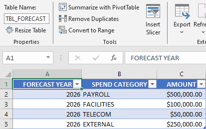
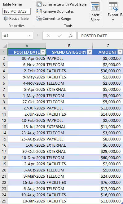
In this example, the data comes from two Excel tables:
TBL_FORECAST: Contains projected values.TBL_ACTUALS: Contains recorded values.
Both tables include similar fields, such as spend category, but they store different metrics. They also use different date formats, which makes direct comparison difficult.
Because of these differences, the tables cannot be used together in a single clustered chart without additional preparation. They must first be reshaped and combined into a unified structure.
Target Table Structure
Before starting, it helps to define the structure to create.
The combined table will contain:
YEARSPEND CATEGORYFORECAST AMOUNTACTUAL AMOUNT
Each metric is stored in its own column, and all rows follow the same layout. This design works well with Power BI visuals and simplifies reporting.
Having a clear target structure in mind helps guide the transformation process and reduces trial and error later.
Instructions
Step 1: Import the Excel Data
- Open Power BI Desktop.
- From the
Hometab, selectGet data. - Choose
Excel workbook. - Select the workbook file.
- Load both tables.
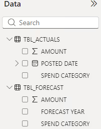
After loading, the Data pane displays two tables:
TBL_ACTUALSTBL_FORECAST
At this stage, review the column names and data types. Make sure dates, numbers, and text fields are correctly detected. Fixing these issues early prevents problems later in the process.
Step 2: Create a Combined Table Using DAX
One straightforward way to combine these tables is to create a calculated table using DAX.
This approach keeps the transformation inside the Power BI data model and avoids creating additional Power Query steps. It is well suited for cases where the source data is already clean and only needs restructuring.
Key Functions Used
SELECTCOLUMNS: Selects, renames, and rearranges fields.UNION: Appends rows from multiple tables into a single table.BLANK(): Creates empty placeholder values.YEAR(): Extracts the year from date fields.
Together, these functions reshape both source tables into the same format and then merge them.
Step 3: Add the DAX Code
In Power BI Desktop:
- Go to the
Modelingtab. - Select
New table. - Paste the following DAX code.
- Press Enter to create the table.
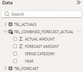
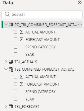
A new table named TBL_COMBINED_FORECAST_ACTUAL will appear in the Data pane with both forecast and actual values.
TBL_COMBINED_FORECAST_ACTUAL =
UNION (
  SELECTCOLUMNS (
    TBL_FORECAST,
    "YEAR", TBL_FORECAST[FORECAST YEAR],
    "SPEND CATEGORY", TBL_FORECAST[SPEND CATEGORY],
    "FORECAST AMOUNT", TBL_FORECAST[AMOUNT],
    "ACTUAL AMOUNT", BLANK ()
  ),
  SELECTCOLUMNS (
    TBL_ACTUALS,
    "YEAR", YEAR ( TBL_ACTUALS[POSTED DATE] ),
    "SPEND CATEGORY", TBL_ACTUALS[SPEND CATEGORY],
    "FORECAST AMOUNT", BLANK (),
    "ACTUAL AMOUNT", TBL_ACTUALS[AMOUNT]
  )
)
Both SELECTCOLUMNS() expressions return the same four columns in the same order, allowing UNION() to append the rows into a single table.
UNION() matches columns by position rather than by name. If the column order changes in either SELECTCOLUMNS() expression, values are appended into the wrong output column even though the formula still runs without error.
Data types must also match across both expressions. Combining a text value with a numeric BLANK(), or a date against a year, produces inconsistent results.
UNION() accepts more than two tables in a single call. Additional SELECTCOLUMNS() expressions can be added as further arguments, provided each returns columns in the same order and data types.
Step 4: Review the Combined Table
After creating the table, open Table view and review the results.
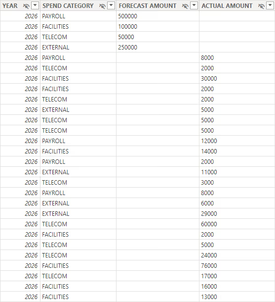
The view displays:
- One unified table with consistent columns.
- Either
FORECAST AMOUNTorACTUAL AMOUNTpopulated per row. - The unused measure column left blank.
- All dates converted to years.
This confirms that the transformation was successful.
If values appear in the wrong columns or years are missing, verify the column references and function names in the DAX formula.
Step 5: Create the Clustered Column Chart
Now that the data is prepared, building the chart is simple.
- Go to
Report view. - Add a
Clustered column chartvisual. - Drag
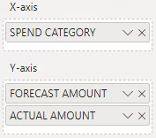
SPEND CATEGORYto theX-axis. - Drag
FORECAST AMOUNTto theY-axis. - Drag
ACTUAL AMOUNTto theY-axis.
Power BI automatically groups the values and displays them side by side.
The chart can be customized by adjusting labels, titles, colors, and tooltips to match reporting needs.
Results
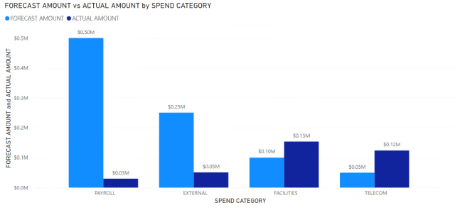
The combined table provides a single reporting structure containing both forecast and actual spending values. This allows the clustered column chart to display the two measures side by side for each spending category.
Alternative Method: Using Power Query
Power Query can be used instead of DAX for transforming data before it reaches the model. This approach is more complex but provides greater control over data preparation.
This method is useful when:
- Source data requires heavy cleaning.
- Multiple data sources are involved.
- Transformations must be standardized.
- ETL logic needs documentation.
Below is an equivalent Power Query solution. It produces the same combined structure as the DAX approach.
let
  Source = Table.Combine(
    {
      Table.RenameColumns(
        Table.SelectColumns(
          Table.AddColumn(TBL_FORECAST, "ACTUAL AMOUNT", each null),
          {"FORECAST YEAR", "SPEND CATEGORY", "AMOUNT", "ACTUAL AMOUNT"}
        ),
        {{"FORECAST YEAR", "YEAR"}, {"AMOUNT", "FORECAST AMOUNT"}}
      ),
      Table.RenameColumns(
        Table.SelectColumns(
          Table.AddColumn(
            Table.TransformColumns(TBL_ACTUALS, {{"POSTED DATE", Date.Year, Int64.Type}}),
            "FORECAST AMOUNT",
            each null
          ),
          {"POSTED DATE", "SPEND CATEGORY", "FORECAST AMOUNT", "AMOUNT"}
        ),
        {{"POSTED DATE", "YEAR"}, {"AMOUNT", "ACTUAL AMOUNT"}}
      )
    }
  )
in
  Source
Table.Combine() appends the rows from multiple tables into a single table. This is different from a Power Query merge, which joins tables based on matching columns.
The DAX approach is fastest to set up and works well for small, static datasets that do not require additional cleaning. Because the combined table is a calculated table, it recalculates on open or refresh, which can affect performance on larger datasets or sources using incremental refresh.
The Power Query approach performs the transformation before the data reaches the model. This scales more predictably as source data grows or requires additional cleaning, and it better supports incremental refresh.
Summary
Combining forecast and actual tables into a single reporting table provides a straightforward structure for building clustered column charts in Power BI. DAX can create the combined table directly in the model, while Power Query provides an alternative approach for data preparation.