Build Filled Donut Charts in Power BI Using DAX & Cards
Donut charts, second only to Pie charts as the tastiest visualization, are used to show the proportions of individual components within a whole. They are similar to Pie charts, but with a hollow center, which often contains additional information. Donut charts are often preferred over Pie charts because the hollow center can hold a summary value, and many consider the style more modern than a traditional Pie chart.
Since the August 2026 release, Power BI Donut charts include a native Center value option on the Visual tab of the Format visual pane, which is the simpler choice for many reports. A filled Donut chart built from Data Analysis Expressions (DAX) measures and Card visualizations remains useful when the center needs content the native option does not provide, such as a total together with a percentage of the total, or separate formatting for each value.
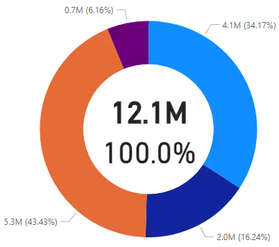
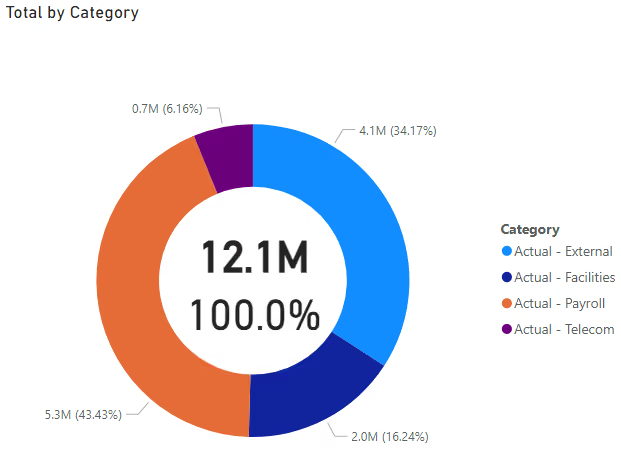
In this example, the Donut chart shows spending in different categories. The center displays two values built from Card visualizations: the total of the selected categories and its percentage of the overall total.
Instructions
Step 1: Create Underlying Data
The data used in this example is shown in the screenshot below. It is a simple Excel sheet with categories in the rows and months in the columns. For the Donut chart, the totals are needed for the Category values associated with actual spend, such as Actual - Payroll, Actual - Facilities, Actual - Telecom, and Actual - External. In other words, only the sum of the Total (Column N) is needed for rows 4 through 7.
The values are formatted using a custom number format (shown below) to display in millions. For example, if the underlying value is 1,000,000, Excel displays it as 1.0 with this format.
#,##0.0,,;[Red](#,##0.0,,)Power BI imports the underlying values without this Excel number format (for example, 1000000 instead of 1.0), so the equivalent display unit is set in Power BI in later steps.

Step 2: Import Data
In the example Excel file, the data is on a worksheet named DATA.
- To create a new Power BI report, click
Import data from Excelfrom within Power BI. - Select the Excel data file.
- Make any necessary cleanup transformations.
- The import creates a new Power BI table named
Table 1 (DATA), which is renamed to the more informativeDATA.

Step 3: Add Helper Column
As mentioned earlier, the Donut chart should display only entries related to actual spend. To do this, a helper column is added to filter the data in later steps. In the example data, rows with actual spend are conveniently prefixed with ACTUAL - , making the logic straightforward. In this snippet, the new column shows ACTUAL if the Category column starts with ACTUAL - . All other rows are labeled as OTHER, including the Total row, which is excluded from the Donut chart by this tagging so it does not appear as its own slice. For simplicity, use the LEN() function instead of counting the characters in the prefix.
DAX string comparisons ignore case, so the ACTUAL - prefix in the formula also matches Actual - in the data.
- In Power BI, select the
DATAtable from theDatapane. - From the
Table toolstab, clickNew column. - Add the following code to create the new helper column.
COLUMN_ACTUAL_CATEGORY
  = IF (
    LEFT ( 'DATA'[Category], LEN ( "ACTUAL - " ) ) = "ACTUAL - ",
    "ACTUAL",
    "OTHER"
  )
The data table now appears (below) with the helper column added. The relevant rows are tagged with ACTUAL in the new column.

Step 4: Create DAX Measures
Now that the data is structured and tagged, a few DAX measures are needed to provide the values displayed in the center of the Donut chart.
For each of the three new measures:
- Select the
DATAtable from theDatapane. - From the
Table toolstab, clickNew measure. - Add the corresponding code below to create the new measure.
The first measure returns the Total column value from the Total row, which equals the total of all actual spend entries in the sample data. Since the sample data already includes this row, the calculation is straightforward. The measure searches for the entry where the Category is Total. To ensure the measure ignores any other filters, the ALL() function removes any existing filters from the table before FILTER() searches for the Total row.
MEASURE_TOTAL_ACTUAL_SPEND_USING_CALCULATE
  = CALCULATE (
    SUM ( 'DATA'[Total] ),
      FILTER ( ALL ( 'DATA' ), 'DATA'[Category] = "TOTAL" )
  )
NOTE: This measure is not displayed directly in a visual. It serves as the denominator for the third measure, and it is also available if the unfiltered total is needed in another visual.
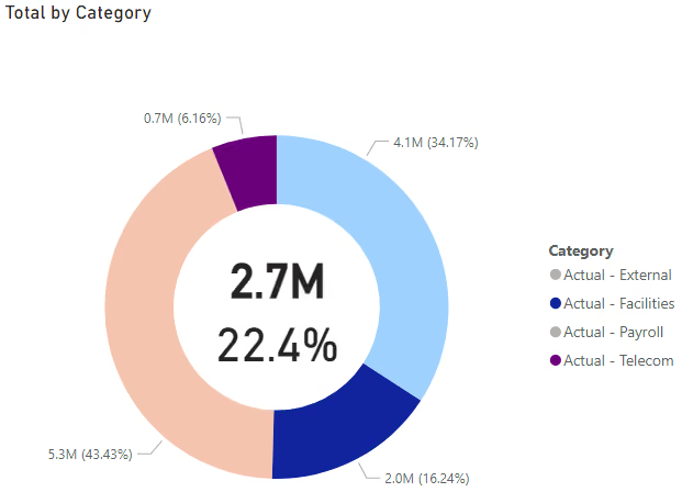
The second measure calculates the sum of the Total column in the DATA table. The ALL() function is not used here because the measure should include only rows tagged as ACTUAL in the helper column. This measure should also respond to user selections and filters in the Donut chart visualization. For example, if a user selects a category, the center calculation will adjust accordingly.
MEASURE_SUM_FILTERED_ACTUAL_SPEND_USING_SUM
  = CALCULATE (
    SUM ( 'DATA'[Total] ),
    'DATA'[COLUMN_ACTUAL_CATEGORY] = "ACTUAL"
  )
The third measure calculates the percentage of the selected entries relative to the whole. By default, the percentage is 100% since all entries are selected initially.
MEASURE_PERCENT_OF_TOTAL
  = DIVIDE (
    [MEASURE_SUM_FILTERED_ACTUAL_SPEND_USING_SUM],
    [MEASURE_TOTAL_ACTUAL_SPEND_USING_CALCULATE],
    0
  )
Click on the newly created MEASURE_PERCENT_OF_TOTAL in the Data pane under the DATA table. Then, go to the Measure tools tab and set the Format to Percentage. Adjust the decimal places to 1.

Step 5: Create Donut Chart
- Switch to the
Report view. - Add a
Donut chartvisualization. - From the
DATAtable, use theCategoryfield forDetailsand theTotalfield forValues. By default, the Donut chart displays every row in the table, so use the helper column added earlier to filter it to only the actual spend categories. In theFilterspane, add theCOLUMN_ACTUAL_CATEGORYhelper column and select only the entries tagged asACTUAL.
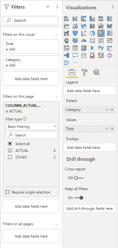
On the General tab of the Format visual pane, expand the Effects section and turn off the Background. On the Visual tab, turn off the Center value section, which is on by default in new reports, so it does not overlap the Card visualizations. In the Values subsection of the Detail labels section, set the Display units to Millions and the Value decimal places to 1.
NOTE: Turning off the background color is important to make the center of the Donut chart transparent, allowing the additional information to be visible.
Step 6: Create Card Visualizations
Two Card visualizations are needed to fill the center of the Donut chart.
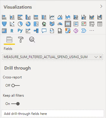
Insert a new Card visualization. The first Card will display the second DAX measure created in Step 4, MEASURE_SUM_FILTERED_ACTUAL_SPEND_USING_SUM, which shows the total of all selected and filtered elements from the Donut chart. Add MEASURE_SUM_FILTERED_ACTUAL_SPEND_USING_SUM to the Fields for this Card.
NOTE: If both
CardandCard (new)appear in theVisualizationspane, either option works with this technique.
On the Visual tab of the Format visual pane, turn off the Category label. In the Callout value section, set the Display units to Millions, set the Value decimal places to 1, and turn on Bold font formatting.
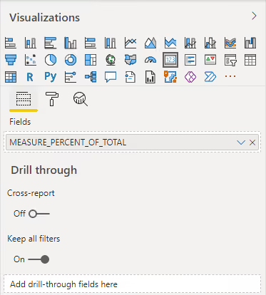
Insert a new Card visualization. The second Card will display the third DAX measure from Step 4, MEASURE_PERCENT_OF_TOTAL, which shows the percentage of the selected and filtered entries in the Donut chart against the total actual spend. Add MEASURE_PERCENT_OF_TOTAL to the Fields for this Card.
On the Visual tab of the Format visual pane, turn off the Category label. In the Callout value section, set the Value decimal places to 1.
Step 7: Formatting and Clean-up
Now that all the components are created, it is time to assemble the final product. Align the two Cards in the center of the Donut chart. Adjust the sizes of the Donut chart and Cards, along with their fonts, until everything looks right. Bring the Donut chart to the front or send the Cards to the back so their corners do not interfere with the chart. This is done by right-clicking a visual and selecting Bring to front or Send to back, or by opening the Selection pane from the Format tab and reordering the layers directly.
NOTE: This layering behaves reliably in Power BI Desktop. After publishing to the Power BI Service, clicking a Donut chart segment can bring the chart forward and temporarily obscure the overlaid Cards, since the Service handles visual interaction and z-order differently than Desktop. Test the published report’s interactive behavior before relying on this technique in a shared dashboard. Because the native
Center valueoption is part of the Donut chart visual, no overlaid Cards are involved.
Results
The final chart displays the calculations in the center of the Donut chart as expected.
If the user selects or filters one or more segments of the Donut chart, the center Cards and DAX measures are recalculated to reflect those selections.
Summary
This article demonstrates how to create a filled Donut chart in Power BI using DAX measures and Card visualizations. By structuring the data, adding necessary filters, and calculating totals and percentages, key information can be displayed in the center of the Donut chart. The final chart dynamically updates based on user selections, providing an interactive and informative visualization. For reports that only need a single center value, the native Center value option is the simpler alternative.