Power BI: Filter Using Card Visualizations and Bookmarks
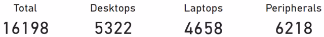
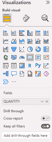
Card visualizations in Power BI display summarized data in an eye-catching way. Cards are typically used to show aggregated segments of a dataset (e.g., subtotals, averages, counts) in a larger font. The following example illustrates card visualizations that show total quantities by device type from the sample dataset.
In my experience, users often try to click on a card, expecting it to filter the report. When I receive feedback like “the report doesn’t work,” I usually joke, “it’s not in the cards.” The user then stares at me in awkward silence instead of laughing. Rinse and repeat.
I hope you got the joke since you’re reading this article. But just in case, I’ll explain it anyway because all great jokes need an explanation (/sarcasm). Unlike most other visualizations in Power BI, card visuals can’t be used to filter a report. To make cards filterable, you’ll need to use bookmarks and shapes. This article explains the basic steps to create filterable card visualizations.
Instructions
Step 1: Data Set Up
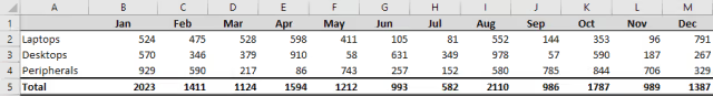
The sample data in this guide includes device categories with monthly quantities. The Power BI report will feature several cards showing the total device count and subtotals by device type.
Power Query is used to retrieve, filter, and transform the data from Excel into the unpivoted columns required for the card visualizations in Power BI. The Power Query steps are listed below for reference.
let
Source = Excel.Workbook(File.Contents("C:\report.xlsx"), null, true),
Sheet1_Sheet = Source{[Item = "Sheet1", Kind = "Sheet"]}[Data],
#"Promoted Headers" = Table.PromoteHeaders(Sheet1_Sheet, [PromoteAllScalars = true]),
#"Renamed Columns" = Table.RenameColumns(#"Promoted Headers", {{"Column1", "DEVICE"}}),
#"Filtered Rows" = Table.SelectRows(
#"Renamed Columns",
each ([DEVICE] <> null and [DEVICE] <> "Total")
),
#"Unpivoted Other Columns" = Table.UnpivotOtherColumns(
#"Filtered Rows",
{"DEVICE"},
"Attribute",
"Value"
),
#"Renamed Columns1" = Table.RenameColumns(
#"Unpivoted Other Columns",
{{"Attribute", "MONTH"}, {"Value", "QUANTITY"}}
),
#"Changed Type" = Table.TransformColumnTypes(
#"Renamed Columns1",
{{"DEVICE", type text}, {"MONTH", Int64.Type}, {"QUANTITY", Int64.Type}}
),
#"Changed Type1" = Table.TransformColumnTypes(#"Changed Type", {{"MONTH", type date}})
in
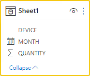
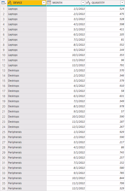
#"Changed Type1"The resulting Power BI table, with columns for device type, month, and quantity, is shown below along with the transformed data.
Step 2: Creating Card Visualizations
Follow these steps to create each card visualization. To avoid repetition, only the steps for creating the desktops subtotal card are shown.
- From the
Visualizationspane, click theCard visualizationto add it to the report. - In the
Datapane, add theQUANTITYfield to the card visualization’sFieldssection. The card will now display the total for all devices.
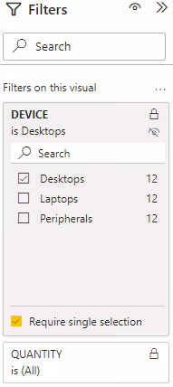
- With the new card visualization selected, open the
Filterspane and add theDEVICEfield to theFilters on this visualsection. Expand theDEVICEfilter and select theDesktopsvalue. The card will now display the total number of desktops.
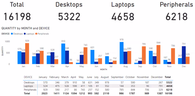
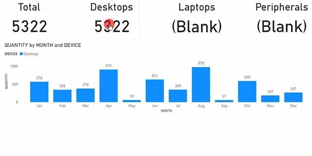
After creating the required card visualizations, the report will appear as shown below. I also added a simple Clustered Column Chart and a Matrix visualization to verify the data summation and filters.
Step 3: Creating Bookmarks
If the Bookmarks pane is not visible, go to the View ribbon and enable Bookmarks from the Show panes section.
NOTE: Power BI bookmarks capture a snapshot of the report’s filters and visuals at the time they are created. If the
Filterspane is expanded when a bookmark is created, it will be open when the bookmark is activated. Make sure the report is in the exact state you want users to see when the bookmark is activated. If changes are made to the report after creating the bookmarks, you may need to update them to reflect those changes.
The first bookmark we’ll create is the DEFAULT bookmark, which resets all filters to their default state, as if the user has just opened the report.
- Once the report is in the desired default state (with all filters set/unset and visuals in the expected layout), go to the
Bookmarkspane and click theAddbutton. - Click the ellipsis
…next to the new bookmark and selectRename. Name the bookmarkDEFAULT.
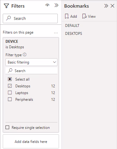
The second bookmark is the DESKTOPS bookmark, which filters the report to show only desktop devices.
- First, reset all filters and visuals to their default states.
- Open the
Filterspane. - In the
Filters on this pagesection, add theDEVICEfield. - Expand the
DEVICEfilter and selectDesktops. - Close the
Filterspane. - Go to the
Bookmarkspane, clickAdd, then click the ellipsis…next to the new bookmark and selectRename. Name itDESKTOPS. - Repeat these steps to create bookmarks for the laptops and peripherals device types.
Step 4: Insert and Format Transparent Shapes
At this point, we have card visualizations and bookmarks for each filter. However, we need a way for users to activate those bookmarks by clicking on a card. Since we can’t add bookmarks directly to a card, we’ll overlay a transparent shape on top of the card.
- From the
Insertribbon, in theElementssection, clickShapesand choose a rectangle option. - Select the newly added rectangle and go to the
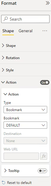
Formatpane. Click theShapetab and expand theActionsection. - Enable the
Actionoption, then chooseBookmarkfrom theTypedrop-down menu. Select theDEFAULTbookmark from theBookmarkdrop-down menu. If not needed, disable theTooltipoption.
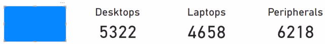
- Resize the shape and position it over the total card visualization. The shape may have a default blue fill, which is left for illustration here.
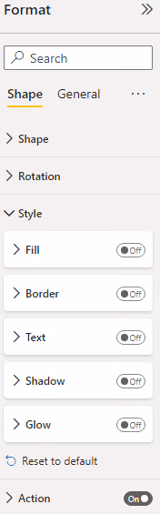
- To make the card visible, remove the fill color. Select the shape, go to the
Formatpane, click theShapetab, and expand theStylesection. Disable theFill,Border,Text,Shadow, andGlowoptions.
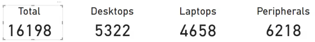
Now, the shape is transparent, and the card visualization is visible. Repeat these steps for each card visualization that should be clickable.
Results
Clicking on the desktops card (which is the transparent shape overlay) activates the DESKTOPS bookmark, filtering the report to show only desktops. Clicking on the total card activates the DEFAULT bookmark, clearing the filters. From the user’s perspective, it looks like clicking on the card filters the report data, and everything works as expected.
Summary
By using bookmarks and transparent shapes, you can create interactive card visualizations in Power BI that allow users to filter reports by simply clicking on a card. This approach enhances the user experience, making the report feel more responsive and intuitive while ensuring the report behaves as expected when users interact with the cards.